top of page

Discordia
Font Specimen

"Discordia" is a type specimen project showcasing a new Hebrew typeface developed at Studio Naipe, in collaboration with Ben Natan. The project explores the inherent tension between order and chaos a theme
that resonates with both the font’s name and
the underlying philosophy of Discordianism.

The graphic design of the book aims
to give voice to the dialogue between tradition and a bold, modern interpretation.
The typeface blends classic Hebrew letterforms with creative freedom, expressed through responsive typography, variable weights, and daring compositions that challenge traditional grid systems.
Design Concept

Throughout this project, I focused on creating a book that serves not merely as a technical manual for testing the font, but as an immersive experience.
The work integrates:
Experimental Typography: The use of layered colors (red over black) and interwoven text blocks highlights the raw energy of the font.


Textual Synthesis: A blend of theoretical text regarding the font and its philosophy, alongside literary excerpts that allow the typeface to "live" within different contexts—ranging from mythology to modern literature.
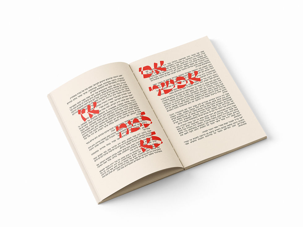

Physical Structure: Designed as a visual tool, the book contains the full character set, punctuation marks, and multi-language support, maintaining a minimalist aesthetic on the cover in contrast to the visual explosion within the pages.


Design Process
The project began with a desire to examine how a single typeface can hold opposing meanings being legible and formal, yet capable of breaking down into abstract, chaotic geometric forms. The process involved meticulous planning of typographic hierarchy, experimentation with shifts in contrast and weight, and tailoring the layout to the physical structure of the book, turning the act of reading into a visual journey for the user.


bottom of page