top of page

The Alchemist -
A personal and visual interpretation of Paulo Coelho's book.
The design is built around the story's geographical and cultural setting.
Since Santiago's journey begins
in Andalusia, moves through North Africa, and unfolds mostly against
a desert backdrop, it felt natural
to bring this deep connection to Arabic and Eastern culture into the heart of the book's visual language.


At the center of the cover is a typographic logo combining Hebrew and Arabic letterforms. This intersection of the two languages creates a visual dialogue reflecting the theme of alchemy - taking different raw materials and shaping them into a new form. The deep cobalt blue background evokes the desert sky, paired with subtle accents of white and gold to symbolize the protagonist's journey from a clean slate to self-discovery.
The Cover & Typography

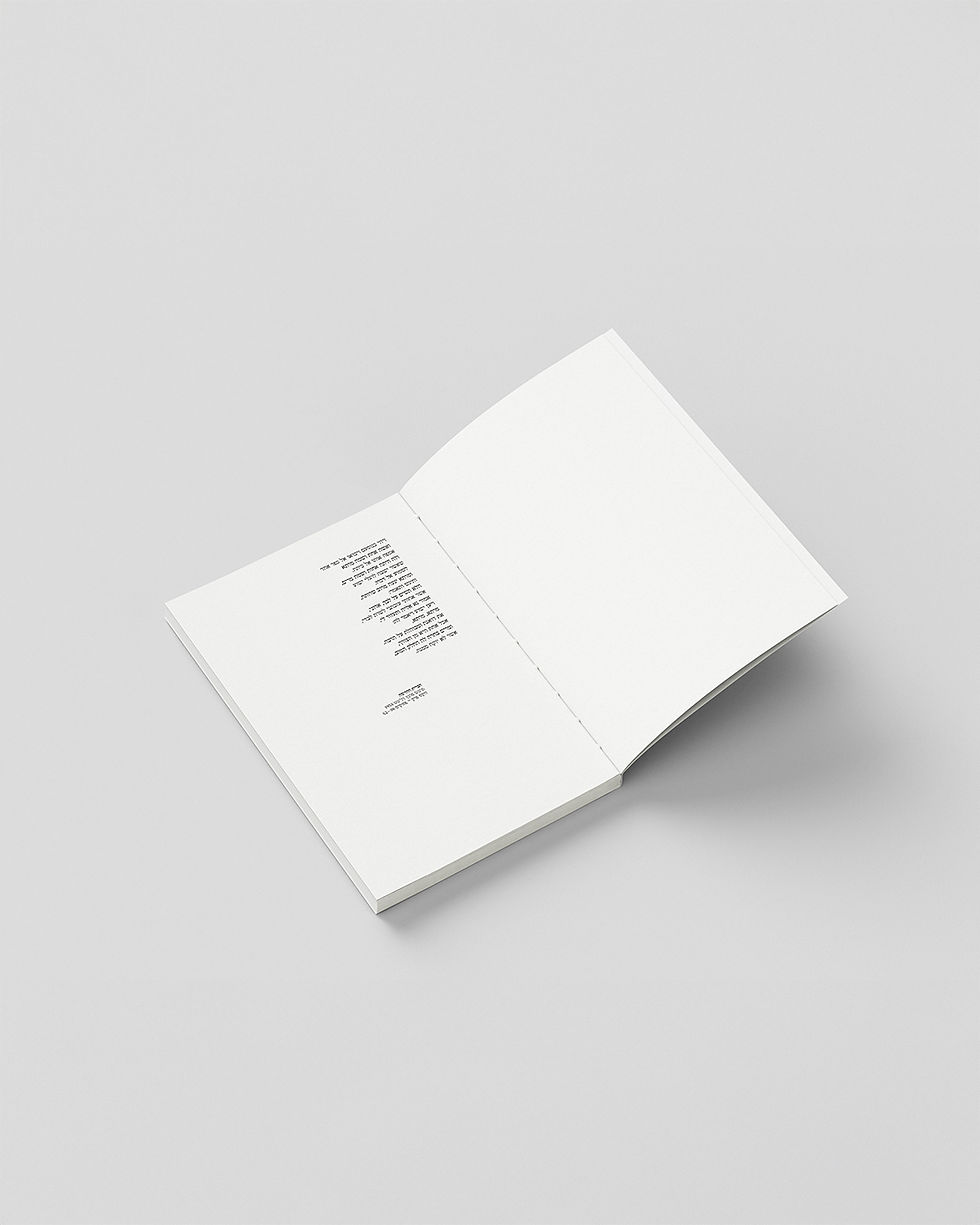
The Interior Layout
Inside the book, the experience begins with the endpapers, featuring a delicate blue line and the Arabic word "Tirhal" which means wandering, offering a quiet, minimalist prelude to the journey. From there, the text pages maintain a clean, restrained layout, giving the text room to breathe and ensuring a comfortable read.

The Initials
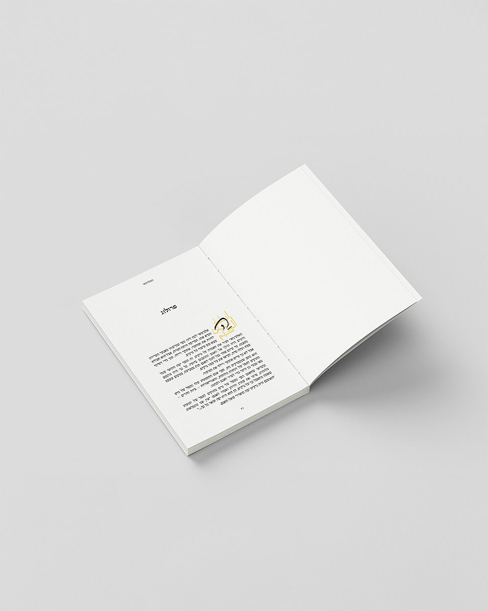
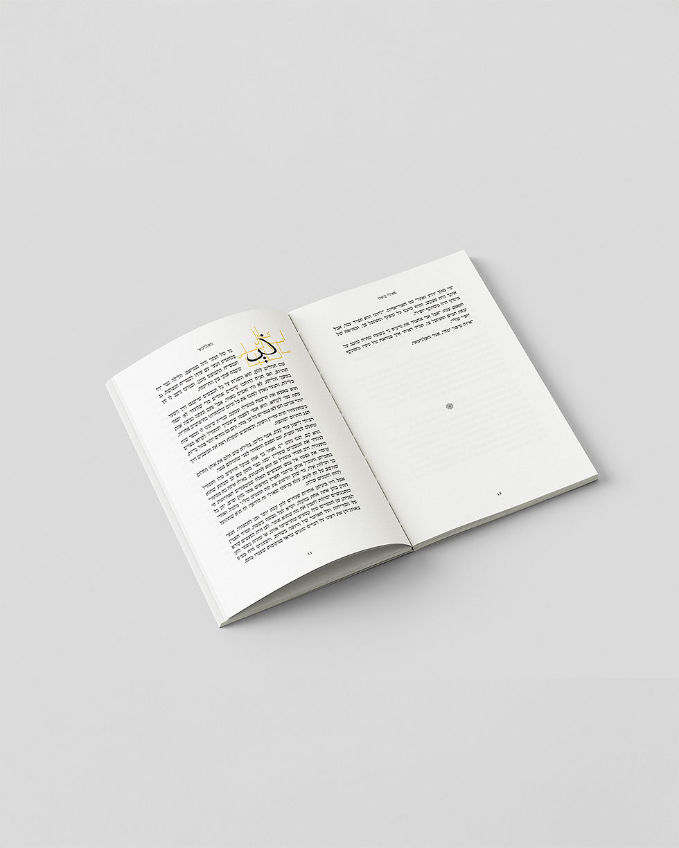
This cultural blend is expressed at the start of each chapter through the design
of the initials. I developed a layered design where the bold Hebrew letter meets calligraphic elements inspired by Arabic script, set against fine golden lines and dots.


Typography
For the body text, I chose the classic FrankRuhl DL v2 AAA typeface,
which brings a warm, familiar, and authoritative feel to the reading experience,
framed within a modern and precise grid. The contrast between the expressive
initials and the clean typography captures the balance between the story's literary tone and contemporary book design.

bottom of page